Why WhatsApp Beats the Contact Form in South Africa
Ask a South African small business where their enquiries come from and most will say the same thing: WhatsApp. Not the contact form, not email, not the phone. It is the channel people already live in, so it is the channel they reach for when they want a quote.
A contact form asks a lot of a stranger. Type your name, your email, your number, a message, then trust that it went somewhere and wait an unknown length of time for a reply that might land in spam. A WhatsApp link asks for none of that. One tap opens a chat they already know how to use, on an app that is already open in the background, with a business that will reply in the same thread they use for family and suppliers. The friction difference is the whole game.
This post is the practical version: where the button goes, what it should say before the visitor types anything, and how to keep it helpful instead of irritating. If you are still weighing whether a WhatsApp presence can stand in for a proper site, read can WhatsApp Business replace a website first — this guide assumes you have a site and want it to feed your chat.
The Problem With Pop-Ups
The instinct, when you want more leads, is to make something jump in front of the visitor: a slide-in after five seconds, an overlay when the mouse heads for the close button, a full-screen "wait — get 10% off" the moment the page loads. These work in a spreadsheet and fail in real life.
Timed and exit-intent pop-ups interrupt someone in the middle of deciding whether to trust you. On a phone — where most SA traffic is — they are worse: they cover the content, the close button is a 12-pixel target, and Google treats an intrusive interstitial that blocks the main content as a quality problem worth ranking you lower for. You are paying a ranking cost and a goodwill cost to shave a few seconds off a decision the visitor was already making.
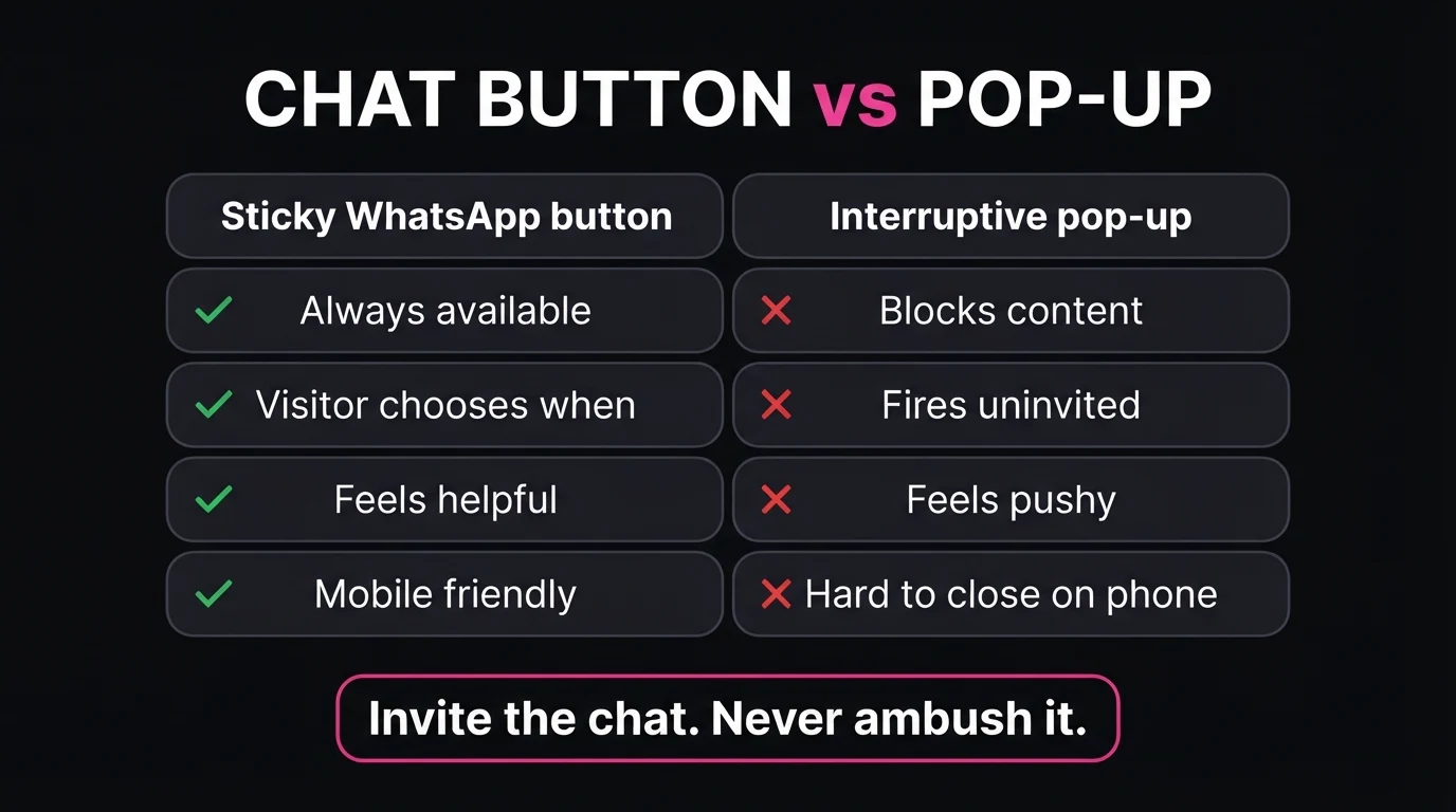
A visitor-initiated chat button does the same job the other way round. It sits there, visible, costing nothing, until the moment a question forms in the visitor's head — and then it is exactly where their thumb already is.
- The visitor decides when to start talking
- The button is where they expect it, every page
- The first message is about their actual question
- Closing it is just… not tapping it
- It reads as "help is here" not "buy now"
- Being stopped mid-sentence by a stranger
- Hunting for a close button that hides
- A discount you did not ask about
- The same overlay again on the next visit
- A reason to close the tab entirely
Where to Put the WhatsApp CTA
Placement is the difference between a button nobody notices and the highest-converting element on the page. You want two layers working together: one persistent button that is always reachable, and a set of inline buttons that appear exactly where a specific question tends to form.
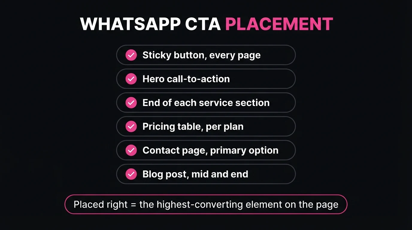
A floating button on every page
Bottom-right on desktop, bottom of the screen on mobile, visible without scrolling, present on every single page including blog posts and the 404. This is the safety net that catches anyone who is ready regardless of where they are on the site.
In the hero, next to the main call to action
Right where "Get a Quote" or "Book a Demo" sits. Some visitors are ready in the first three seconds. Give them a chat option before they have to scroll or think.
At the end of every service description
A visitor who has just read your "bathroom renovations" section has a question forming right now. A button there — pre-filled with that service — catches the thought before it cools. Do not make them scroll back to the top or hunt for contact.
Beside each pricing plan
Price is where hesitation lives. A "Chat about this plan" button next to each tier lets someone ask "does that include callouts?" without leaving the page or filling in a form. Pricing pages with a per-plan chat option consistently start more conversations than ones with a single form at the bottom.
On the contact page, as the first option
Keep the form for people who want it, but put WhatsApp above it, bigger, as the default. Most visitors who reach your contact page have already decided — do not slow them down with fields.
Mid-article and at the end of blog posts
If someone is reading a 1,500-word guide on your site, they are researching a decision. One inline button around the halfway mark and one in the closing section turns that reading time into a conversation.
The single biggest jump I see is moving the button off the contact page. A lot of SA business sites hide their only WhatsApp link on a "Contact" tab, three clicks from where people actually are. When we add an inline chat button at the end of each service section — pre-filled with that service and the visitor's suburb prompt — the number of enquiries usually climbs within the first fortnight, with no new traffic and no pop-up anywhere on the site. The leads were always there; they just could not find the door.
Open your own site on your phone right now. From the middle of a service page, how many taps to an open WhatsApp chat? If the answer is more than one, that is your first fix.
Write the Pre-Filled Message So the Lead Starts Warm
Every WhatsApp link can carry a pre-written first message. Most businesses either skip it or use a lifeless "Hello". Both waste the best part of the tool. A good pre-fill tells you which page the person clicked from, what they want, and gives you enough to reply with a real answer instead of "Hi, how can I help?"
The rule: write it in the visitor's voice, make it specific to the page, and leave a natural blank for them to fill. Here is the pattern per page type.
| Where the button is | Pre-filled message the visitor sends |
|---|---|
| Homepage hero | "Hi Chris, I'd like a free demo for my business — we do ______ in ______." |
| A service section | "Hi, I need a quote for [that exact service] in [suburb/area]. Roughly ______." |
| Pricing — Growth plan | "Hi, I'm looking at the Growth plan. Can you tell me what's included for ______?" |
| Contact page | "Hi Chris, I'd like to chat about a website for ______." |
| End of a blog post | "Hi, I just read your post on ______ and I've got a question about my own site." |
Two things make this work. First, the visitor can send it as-is in one tap if they are in a hurry — you still get a usable lead. Second, if they do edit it, they are editing toward detail, which means your first reply can be a real quote range or a real answer, and a fast, specific first reply is what turns a chat into a job.
Keep the tone plain. This is the same principle as writing the rest of your site — say the useful thing in the customer's words, not the brochure's. Our guide on website copy that sells covers the wider version of that idea.
Track It So You Know Which Placement Works
If you cannot see which buttons get used, you are guessing. The fix is small: fire a Google Analytics event on every click-to-chat link, with a label for where that link lives.
- Event: something like whatsapp_click, so all chat clicks group together.
- Label: the placement — hero, service-plumbing, pricing-growth, blog-footer, float. This is the part that tells you what to keep and what to move.
- Then follow it downstream: of those clicks, how many became real conversations, and how many of those became quotes and paying work. Clicks are a vanity number on their own.
After a month you will know, in plain numbers, that (for example) the per-service buttons drive four times the conversations of the floating button, and the exit-intent pop-up you were considering would have been a distraction. That is the difference between measuring activity and measuring outcomes.
Want the chat button set up properly on your site?
We build the floating button, the per-page inline buttons, the pre-filled messages and the analytics tagging as part of every site — and we can retrofit it to an existing one. Send a message and we will take a look.
48-hour free demo · No deposit before you approve it · Centurion, serving all of SA
A Few Mistakes to Avoid
Making the floating button huge or animated
A pulsing, oversized green blob that covers a third of a phone screen is a pop-up wearing a disguise. Standard size, gentle, out of the way. It should be findable, not unavoidable.
One generic link for the whole site
If every button opens the same blank chat, you have thrown away the context that makes WhatsApp better than a form. Per-page pre-fills cost a few minutes each and pay you back on every lead.
No one actually watching the inbox
A click-to-chat button sets an expectation of a quick human reply. If messages sit for a day, you are worse off than with a form, because the visitor knows you saw it. Decide who is on the WhatsApp before you promote it, and set an honest away message for after hours.
Using it as your only channel
Some visitors — older buyers, people at a work desktop, anyone who wants a paper trail — still prefer a form or a phone number. Lead with WhatsApp, but keep the alternatives one scroll away. This is the same "don't over-trim" logic from how many pages a small business site needs: give people the route they want, not the one that is easiest for you.
The Bottom Line
You do not need a pop-up to turn visitors into leads. You need the chat button to be everywhere it should be, to know which page it was clicked from, and to open with a message that lets you reply usefully in one go. That is a quiet, visitor-led system that Google is fine with and customers actually like.
Put a floating button on every page. Add inline buttons at the hero, each service, each price, the contact page and your blog posts. Pre-fill every one. Tag every click. Then read the numbers after a month and move the buttons that are not pulling their weight.
- Two layers, no pop-ups. A persistent floating WhatsApp button on every page, plus inline buttons at the hero, each service, each price, the contact page and blog posts.
- Pre-fill every link. A page-specific first message in the visitor's voice means your reply can be a real quote, not "how can I help?"
- Tag and measure. A Google Analytics event with a placement label on every click tells you which buttons to keep and which to move.
Go Deeper: Related Guides
Frequently Asked Questions
Is a WhatsApp button better than a contact form?
For most South African small businesses, yes. A contact form asks the visitor to type their details, trust that the message arrives, and wait an unknown time for a reply. A WhatsApp link opens a conversation they already know how to use, on an app they already have open. Keep the form for people who prefer it, but make click-to-chat the primary, most visible option.
Where should the WhatsApp button go on my website?
Put a persistent floating button on every page, plus inline buttons at the natural decision points: the hero, the end of each service description, next to each pricing plan, on the contact page as the first option, and near the end of blog posts. The floating button catches people who are ready; the inline buttons catch people at the moment a specific question forms.
What should the pre-filled WhatsApp message say?
Write it from the visitor's point of view and make it specific to the page they clicked from. "Hi, I'd like a quote for a bathroom renovation in Centurion" starts the conversation warm and tells you which service and area to talk about. A blank chat or a generic "Hi" makes the visitor do the work and slows your reply.
Do pop-ups hurt SEO and conversions?
Intrusive interstitials that block the main content on mobile can be a Google ranking negative, and even when they are not penalised they raise bounce rate and irritate people. A visitor-initiated chat button does none of that. If you must use a pop-up, delay it, make it easy to close, and never cover the content someone came to read.
How do I know if the WhatsApp button is actually working?
Tag every click-to-chat link with a Google Analytics event and a label for its location, so you can see which placements drive real conversations. Then track how many of those chats turn into quotes and paying jobs. Clicks alone are a vanity number; the pipeline from click to conversation to customer is what tells you the placement works.

Chris Maboyi
I build websites for South African businesses in Centurion, Pretoria and across Gauteng — design, hosting, SEO structure, and the lead-capture details like click-to-chat that decide whether traffic turns into work. Every project starts with a 48-hour free demo: real, live, no deposit before you approve it. Get in touch or WhatsApp me directly.